|
For this challenging assignment, I practiced using links and making links using HTML on Sublime Text. I used neocities.com to share my HTML and CSS designs, this is a website where you can see people's code. Link below 🔽 https://drpink.neocities.org/ 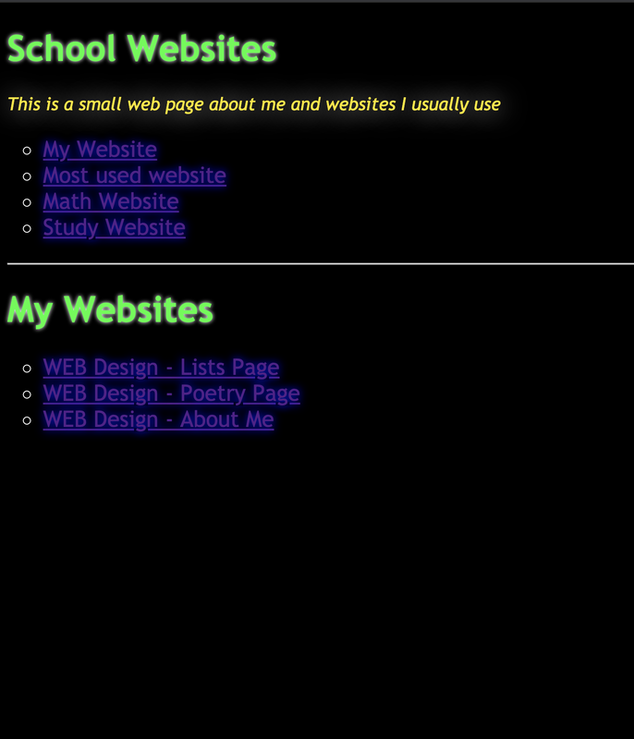 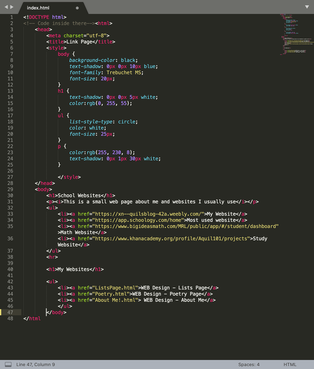
0 Comments
For this assignment, I practiced creating different types of lists using HTML and CSS. My first list was a bullet list and my second, was a numbered list. I gave the ingredients and ingredients to make a philly cheesesteak. This assignment wasn't as difficult but it was fun, even though I already know a lot about HTML and CSS, doing these assignments gives me great pleasure. The first slideshow below is my a screenshot of my outcome website. The second two pictures is a screenshot of my code on Sublime Text! 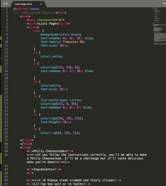 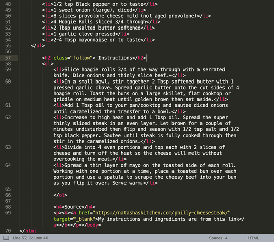
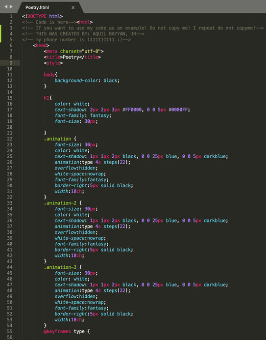
For this fun assignment, I needed an HTML tag, a head tag, a title tag, a body tag, and three poems. I needed a Haiku poem, limerick and a free verse. All the headings for the poems needed to be the same and I needed at least 3 bold and italic words. Below is a slide show of my poetry and below that is a screenshot of my code on, Sublime Text.
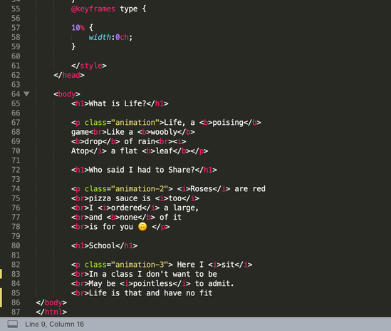
What is Life?Life, a poising game Who said I had to Share?Roses are red SchoolHere I sit For this assignment, I had to make a simple web page on Sublime Text. I needed a HTML tag, 6 different headings, a title, a body tag, a main heading tag, and 6 small paragraph tags. Our simple web page could be about anything we want (school appropriate). Below is a screenshot of my web page and a screenshot of my code.  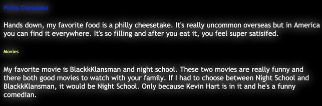 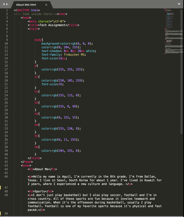 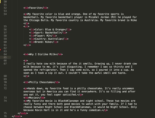 For this assignment, we had to download sublime text and make a comment. Throughout 8th grade web design, we'll be using Sublime Text for computer programming.  For this assignment, I need to vectorize three different logos. The most challenging and frustrating part, was making sure they were all different in their own unique way. Another challenge, was making sure I made them the same size. My favorite part during this process was when I changed the colors, the colors give it a certain vibe to it. I was able to mix colors together to get a whole new version. I learned that you have to take your time when making logos. It's not as easy as it seems. The more patient you are the better the outcome. 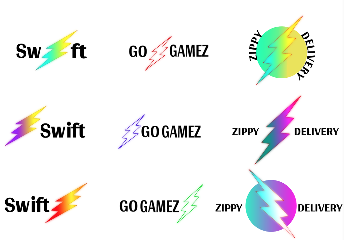 My logos were inspired from a Netflix series called, The Flash. The thunderbolt bolt represents it. The thunderbolt symbolizes, fast and quick, the thunderbolt give's the word's meaning of what my brand is. The process was fun and challenging, the frustrating part of this was, coming up with the idea and brainstorming. I really enjoyed it, but the most difficult part was drawing my logo and the easiest part was coming up with the names. 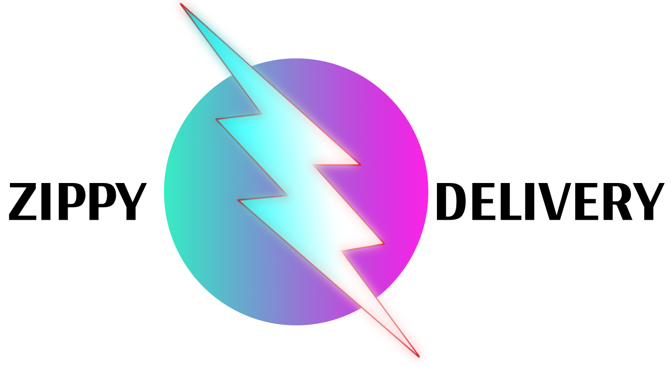 My brand for my logo was the thunderbolt. My brand is for delivering games and for buying games. The three logos I chose were, Swift, Zippy Delivery and Go Gamez. These three logos represent fast delivery and making these quick and simple. The thunderbolt symbolizes, fast and quick, the thunderbolt give's the word's meaning of what my brand is. I like the three I choose and the Quick Gamez logo. The rest, I don't really like. The process was fun and challenging, the frustrating part of this was, coming up with the idea and brainstorming. I really enjoyed it, but the most difficult part was drawing my logo and the easiest part was coming up with the names. For my projects, I had to choose a shape or object and change it into different colors. We learned about how colors contrast and colors that would go together. On my color scheme project, I used Adobe Color to choose my colors. Our projects had to be neat, aligned and evenly spaced out. My biggest challenge when making my projects, were making sure it was aligned perfectly and making sure to save my work. I overcame my challenge by using the arrow keys to position my shape's and saving my work every 3 minutes. I'm proud at the color and vibe my artwork gives out, I like the background and the creativity I put in it. In gravit design, the tools I used were text box and pointer. The inspiration behind my artwork was making it simple but not to simple. Color Names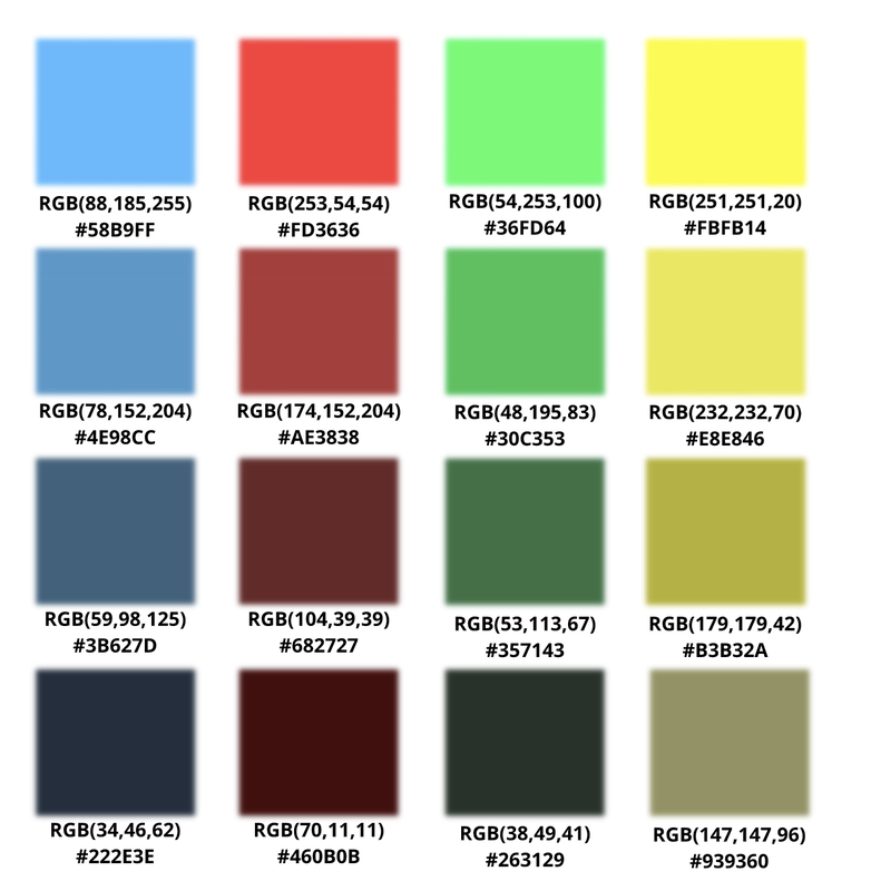 Color Schemes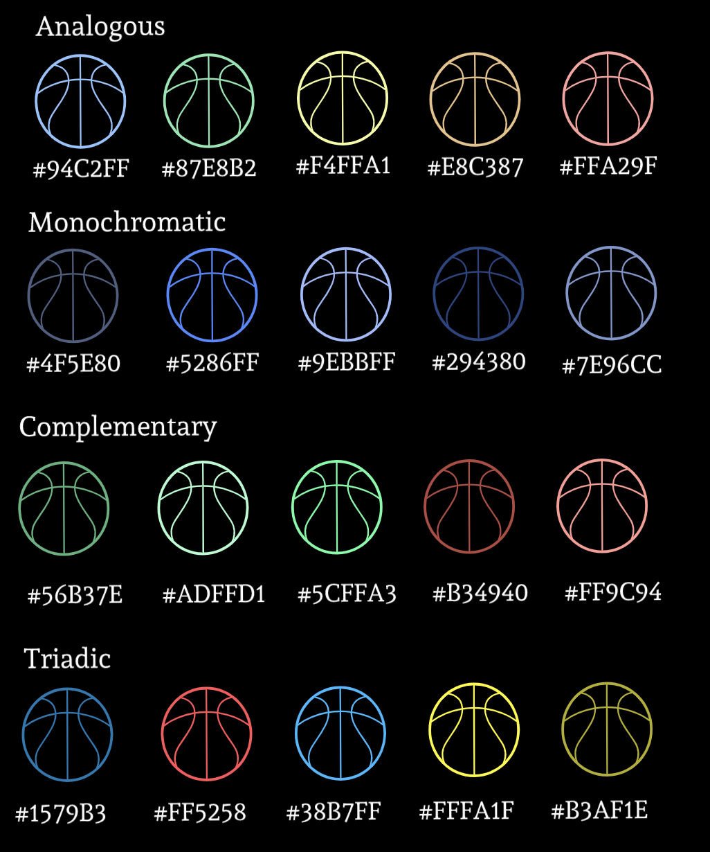 In typography I learned how to be neat and organized. I also learned how to make my font's easier to read and neat. Typography means the style and appearance of a font. Typography is important because it shows the creativity of font's and it provides a smooth reading experience. The quote, "Each font has a personality and a purpose." This means that each font gives a different message the way you want to use it. An example is, Serif fonts, they give a formal tone and stability. Different font's convey different messages or meanings. The five fonts we learned were Serif, Sans Serif, Monospace, Script, and Novelty. You would use serif fonts in letters or in titles. You would use Monospace font's in manuals and resources for programming languages. Script font would mostly be used in displaying a painting. Novelty would be used in maybe comic's or scary intro's of a movie. Typeface ComparisonFor this assignment I had to use 5 fonts, Serif, Sans Serif, Monospace, Script and Novelty. Then I had to type text, using each of the fonts. I showed the difference of each of the fonts and what they look like and what they convey. 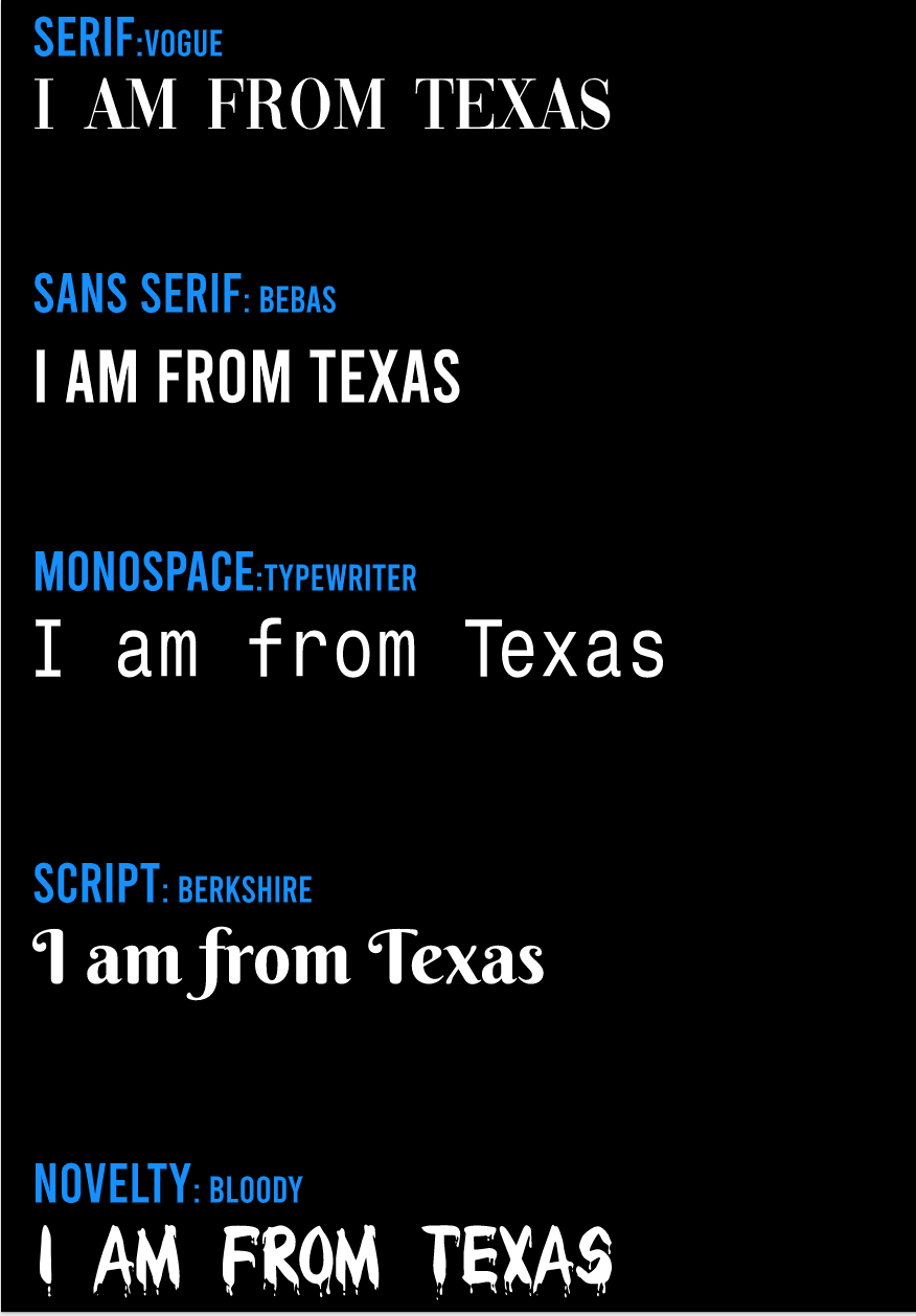 Word PortraitsFor this assignment, I had to choose 10 fonts of my own and I needed to show when it's a good time to use them and a bad time to use then. During this assignment I learned which fonts are good to use and the different feelings they give off. An example, is the bloody font, it gives off a zombie scary feeling. Each font is unique and different in it's own way. 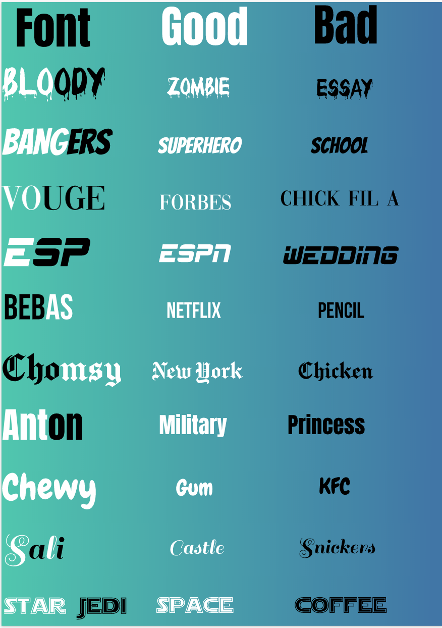 For this exercise I had to use the pen tool. I needed to trace, mask, curve, and make straight lines. A pen tool is a tool that's able to trace images the way you need to. For example, if you have to cut out a circle you would need to curve your cursor around the circle using the pen tool. The picture below this paragraph is a picture of LeBron James. Below him is a trampoline and him about to dunk. The two symbols on the corner is his logo which means the king. The problems I had with using the tool pen was when I trying to make my image very precise when tracing a human. Also, when I had to curve on a image using the pen tool that was a little bit difficult. 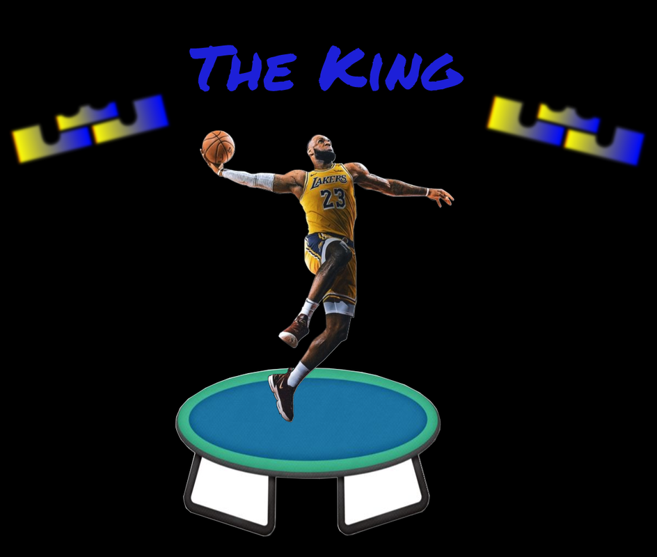  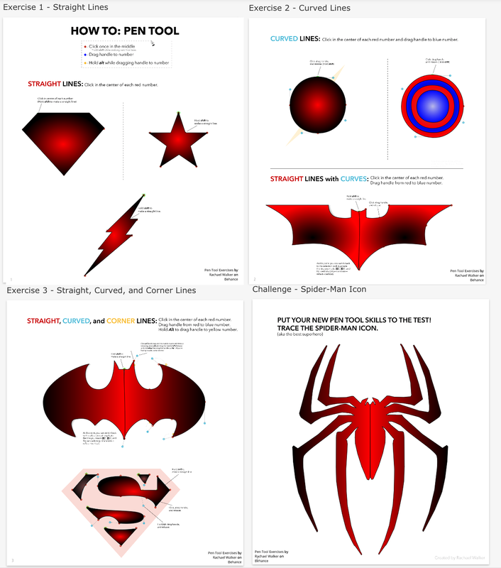 I have used khan academy before and these are the projects I've made with JavaScript and HTML. I learned how to make variables, shapes, functions, text, animation, if then statements and commenting. Variables store value in objects to create it you type var a name and give it a value. To create a function you give declare it by typing var then a name. It will repeat code without typing it entirely will allow you to repeat things, draw things and you can do other things. For if then statements you want to be able to say "if this thing is true, then do this but if this other thing is true, then do this. It's like when you it's cold, if it's cold outside then I take I wear pants and jackets but if it's sunny, I wear sunglasses and shorts. Commenting is important because it can tell the person who's seeing the code what will happen and what each code is doing. Coding allowed me to create things I thought were impossible were to create and I had fun. Magic 8 Ball 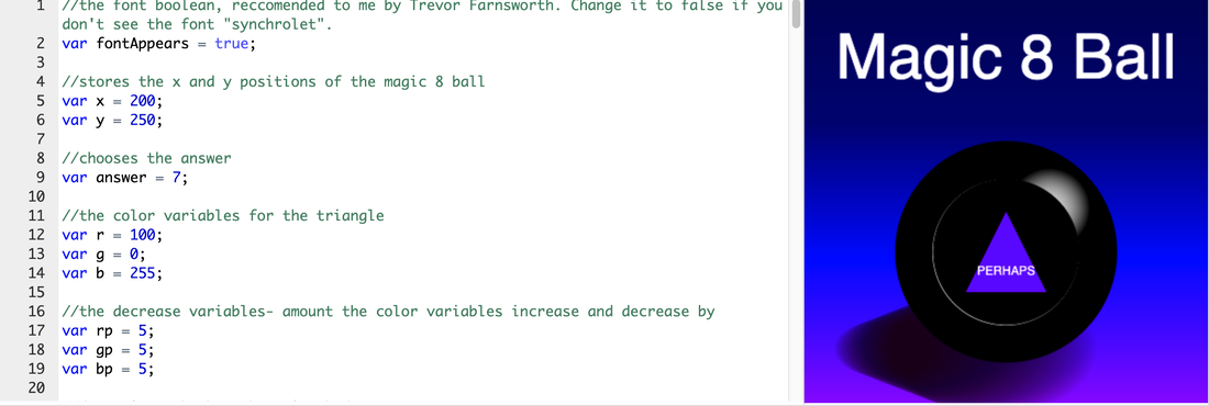 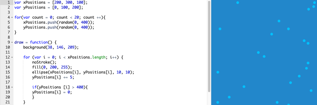 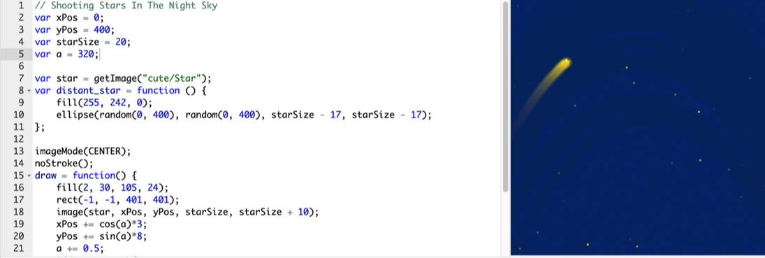 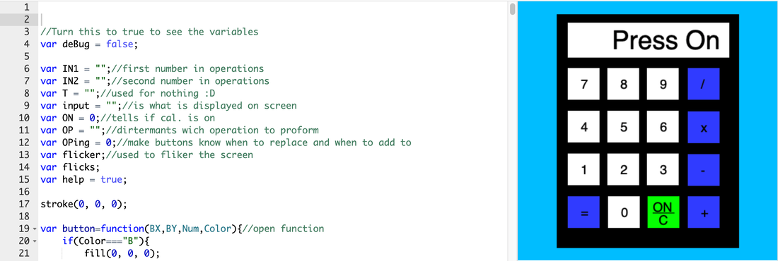 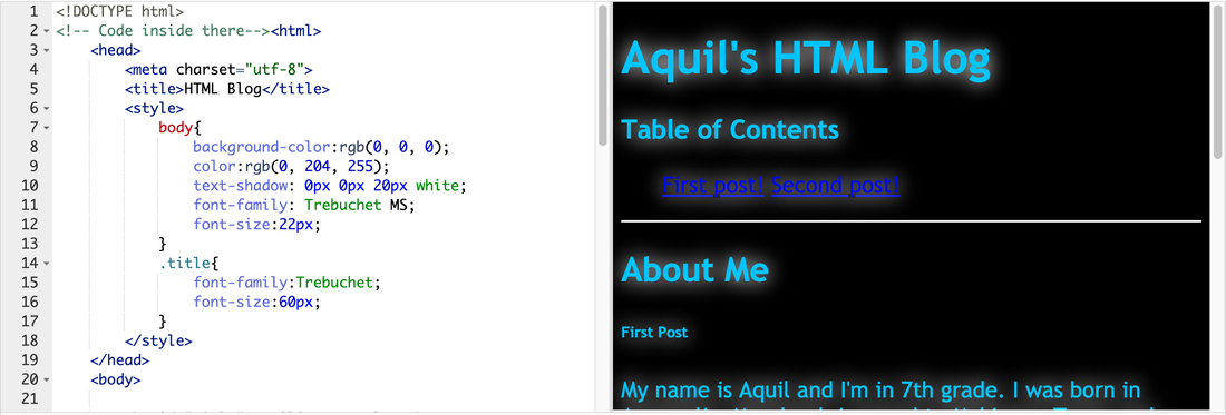 In Gravit, I learned how to make complex images and change them into other shapes and objects. The reason why I created this was because pac-man is a on of the classic games that have been around for a while, since the 1980s. My design comes from one of my favorite movies, Pixels on Netflix. Also pac-man is a game at arcades that many people played growing up, sometimes I play it when I'm bored. 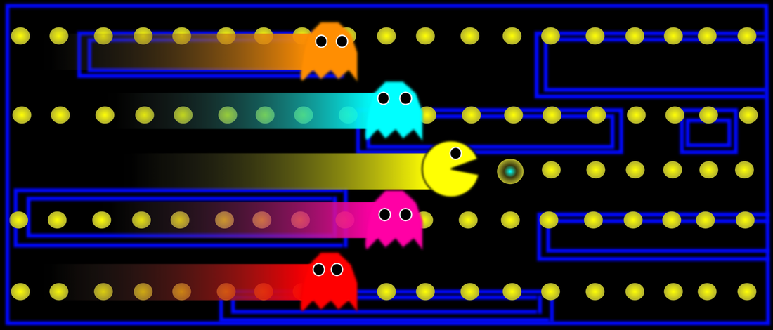 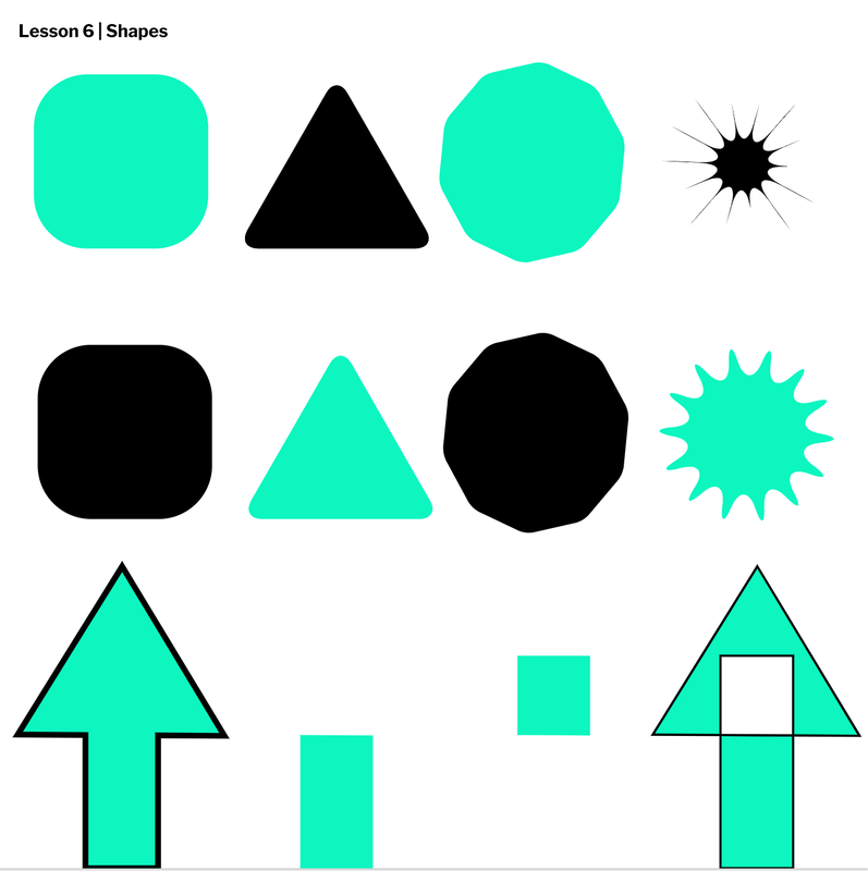 In this lesson I learned how about union, subtract, intersect and difference. Also I learned how to change a circle's points and corner's.
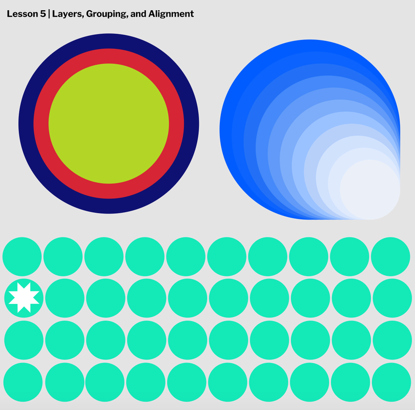 I learned how to send shapes to the back or the front using command shift up and command shift down. Also I learned how to duplicate shapes by pressing shift and clicking on the shapes to copy. I learned the different alignments and making my work organized and neat.
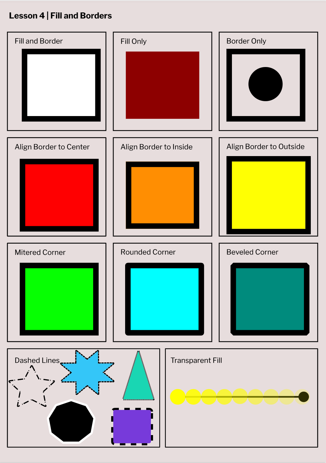 In this lesson I learned how to make shapes transparent and change their border. I also learned how to change the width of a shapes border.
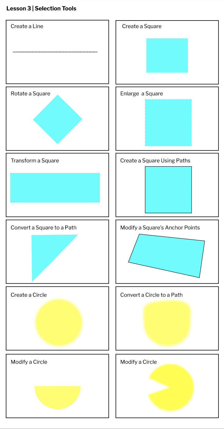 In this lesson I learned how to create images and change the color, size and shape. Also I learned the shortcuts for pointer, sub-select and pen.
Graphic design is design through the typography, photography, and illustration. Graphic design can also be used for making websites, album covers, signage and many other things. Below is an example of a graphic design. I don't have experience of graphic design. 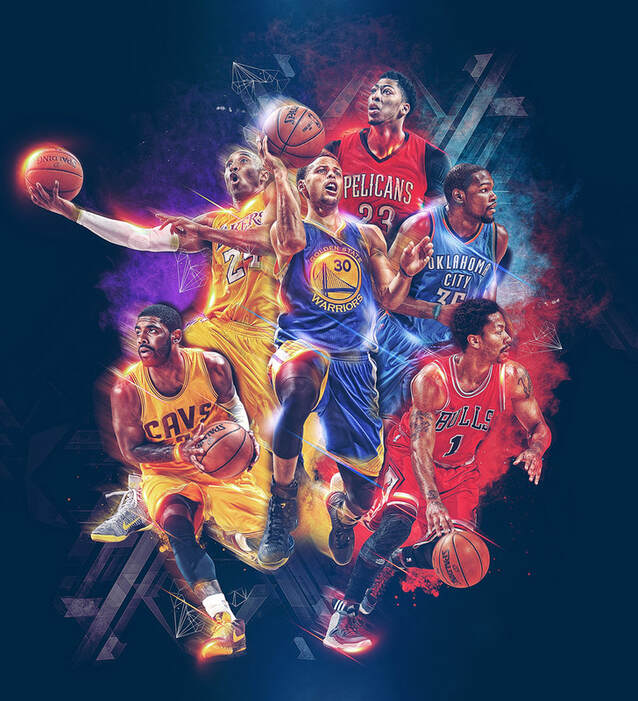 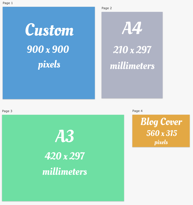 When using gravit I learned how to change the font and size of my text. Also the different dimensions of A4, A3, custom and blog cover. I learned how to add all of my pages together and changing the color.
Public Domain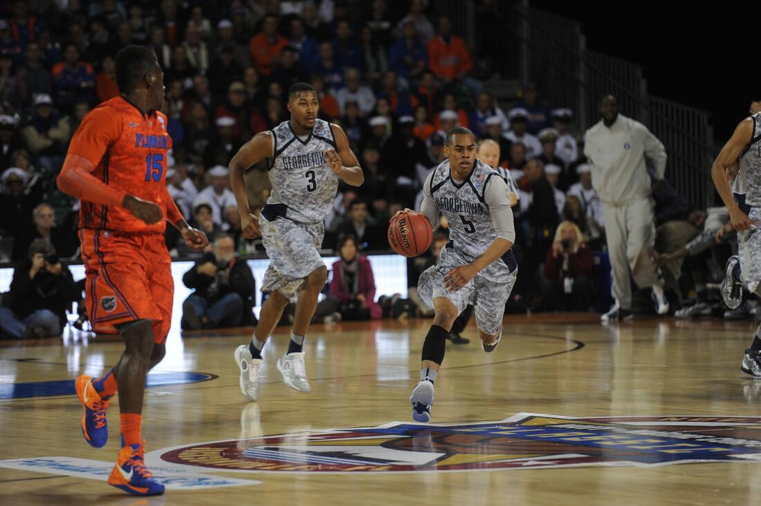 This picture is from the public domain so I can use it freely and however I want. Attribution I can do anything with this image as long as I give credit to the creator. Attribution Share-alike With this image, I cannot make a new license and I must give credit to the original creator. Attribution Noncommercial I can copy, modify, and change this image but I cannot make money out of it and I must give credit. Attribution Noncommercial Share-alike I can copy, modify, and change this image but I cannot make money out of it and I must give credit. Attribution No Derivatives I can share and copy this image but I cannot change or modify this image and I must give credit. Attribution Noncommercial Noderivs I can share, copy, and modify this image but I can't sell it and I must give credit. Copyright I should use this under fair use and I must get the creator's permission to use this image.
|
Archives
September 2020
Categories This work is licensed under a Creative Commons Attribution-NonCommercial-NoDerivatives 4.0 International License. |
 RSS Feed
